Categories
The Marketeer

Always More Complicated

Lying with statistics is a topic that comes up all the time on Marketing Over Coffee and you’d think it would get old, but the latest crazes of dashboards, infographics and the like just continue to fuel the fire.

Point #1: Statistics that show you a pie chart to make you feel better are misleading you and hiding a bunch of thorny questions. For better or worse, every time I’ve dug into the numbers I’ve found questions that are difficult to answer and force you to ask even more difficult questions.

Over the 4th I found an interesting article on the fact that many flags and patriotic clothes are not made in the United States. That article claims only 2% of the apparel sold in the US is made here. Wearing clothing that celebrates America that wasn’t made here is an interesting issue, it then gets pushed much farther by talking about U.S. flags being used on caskets for our military and proposed legislation to require that they be made in the United States (the majority are made in China). This is the “digging deep gets complicated” phenomenon, clothes being made outside the U.S. seems like not a big deal on the surface, 4th of July items being imported feels strange, our tax dollars for flags for those who made the ultimate sacrifice paid to a nation that’s not that big on freedom feels like a crime.

The article then cites research from Consumer Reports (a favorite publication of mine): “Given a choice between a product made in the U.S. and an identical one made abroad, 78 percent of Americans would rather buy the American product”. This brings to light three more important points:

Point #2: Creating a survey question that is not biased takes a lot of work.

Biased questions gets right to the point of why we joke on Marketing Over Coffee about most surveys sucking. A question like “Are you an ungrateful non-patriot that wouldn’t want to buy clothes made in the US?” will probably cause some problems with your survey.

Point #3: People lie in surveys.

Saying people lie is just me being sensationalist (after all, this is a blog). People don’t intentionally deceive, but they answer with their hearts and often don’t want to disappoint the person asking the questions in the survey for any number of reasons. Proving point #1 in action – if 78% of Americans really want American products you’ve got a hard time explaining the 2% apparel stat.

Point #4: Apathy rules.

In the 2% apparel case we might explain the gap with apathy: Maybe 8 out of 10 people really do want to buy American first, but it’s not high enough on their priority list to check a label every time they buy clothes. As a parent with 2 young children I have first hand knowledge of shopping and getting home with no real clue or understanding what’s in the bags I’ve brought home.complicated

That leads us to the real lesson:

Point #5: It’s About Seeing the Complications.

It’s not about stats to create graphs, it’s about digging in to ask more questions to understand what forces are at work. Are you losing business because of the economy or because a better product has come along? Are people not buying American because of price or a lack of knowledge about the economic impact of where products come from? Are prospects not smart enough for your product, or is it that your product is so boring that nobody cares?

I’m sorry to say that many times I’ve dug in and not been satisfied with the answers I’ve found. I can say that I’ve almost always come out with  a better understanding of what’s really happening.


P.S. If you’re tired of shaky statistics that are generating worthless discussion and not having any impact on the bottom line you might want to read more from Avinash Kaushik. Tom Webster also knows something about surveys.  They both write clearly about avoiding bias and getting actionable information out of the questions you are asking.
Categories
SalesForce.com

Advance Campaign Management

The reporting suite in Salesforce.com is sort of like the $100 tool kit you get at Home Depot. It has all the standard stuff (screwdrivers, sockets, wrenches, pliers in a stylish red box of some kind), and if you know what you’re doing it will work for most everything, and for more advanced stuff you could make it work, although if you are a pro you’ll want more power tools.

As part of a webinar I did with Salesforce we started to discuss one of the big problems with campaign measurement – the fact that your data is only as relevant as the number of closed deals you have. I had done a presentation on this a few years back and had some requests for it and found that it was the classic “Consultant’s Powerpoint” – lots of pictures, and useless unless you know the story.

So here’s the story. In a perfect world you’d measure how many closed deals came from your campaigns, have a simple dashboard showing the dollars generated and go home a hero. In reality, odds are you’re going to start tracking and measuring, right to the point of reallocating budget prior to the first deals closing – a classic “Fire, Aim, Fire.”

The first thing to confirm is that you are getting a primary campaign source for every opportunity. This is one of the more recent adds to marketing tracking and it’s the closest thing you’ll get to a silver bullet. Doing an initial pass and confirming that every opportunity has a primary campaign (even if it’s “Unknown”) allows you to run some interesting reports and start to get a picture of where the deals and inbound leads are coming from. For most cleanup like this I’ve found that the Salesforce Excel Connector is your cordless electric drill – a killer power tool. It’s kind of a hassle to set up, between finding a copy of Excel 97 and learning how the macros work, it takes some elbow grease, but it pays for itself quickly – imagine being able to find all opportunities from the past month, be able to match them to all the contacts and leads from a specific company and update these fields in Excel directly rather than pulling them up in SF or having to use the bulk loader. I’m also a bit surprised there’s nothing better out there, if you know of anything else like it, please share.

Now that you have an idea of what programs are working here are some common factors to examine:

  • Any specific type of program better than others (Webinars vs. Whitepapers, Live Events)
  • Region and/or Account Manager – this can get into management of the sales team
  • If PPC is productive
  • Does training drive adoption and increase retention?
  • Isolate and report on telemarketing or other lead qualification

One topic that would require a post of its own (or maybe even a whole book, which might be the most boring book ever) is what to do with deals that close from multiple campaigns. Campaign weighting is not trivial (saying the white paper is 20% responsible for the win, 80% of it goes to the demo). Although it gets complicated quickly there are two reasons to do it: one is to try multivariable testing – do any combinations of campaigns do considerably better than others? The other is to give your reporting credibility. By default most reports that show a closed deal that went through multiple campaigns will assign all the dollars to each campaign. In other words, a $40,000 deal that went through 4 campaigns makes it look like your 4 programs generated $160,000 in sales. These kind of reports are just the kind of thing the CEO is looking for so you can take his place picking up trash in an orange jumpsuit when the tax auditors come calling.

Fight Chart
Use the USA Today Effect to your advantage

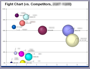
Depending on your market you’ll probably also want to add fields at the opportunity level to track both competitors, and incumbents. It’s very common to find that you will be more effective against certain competitors. You may also find that certain incumbents may indicate that you’ll never get budget for the project. I’ve found a bubble chart like the one in this post can give you an interesting view of your forecast, showing both aging, percentage to close, and competitors.

Another area that requires a lot of planning is both lead status and campaign member status. You’ll want anything showing movement in the funnel as lead status, anything showing progression through a program as campaign member status and these have to be mapped. You may have to do some automation to have the lead status updated as campaign status changes. These also make great triggers for marketing automation efforts…

For more complicated graphs you can go across multiple objects (contacts and opportunities for example), which limits some of your graphing options if you were to use Excel, but I’ve always found that being able to schedule reports and show them in dashboards is the only real route to adoption. People only get into the excel graphs when the quarterly board of directors meeting is coming together, which may be all you need it for.

If you’ve run any interesting reports or have found other tools you like, please share, there are a lot of new solutions as this space is evolving quickly.